How to Build a Scientific Research Poster That Wins Best Poster
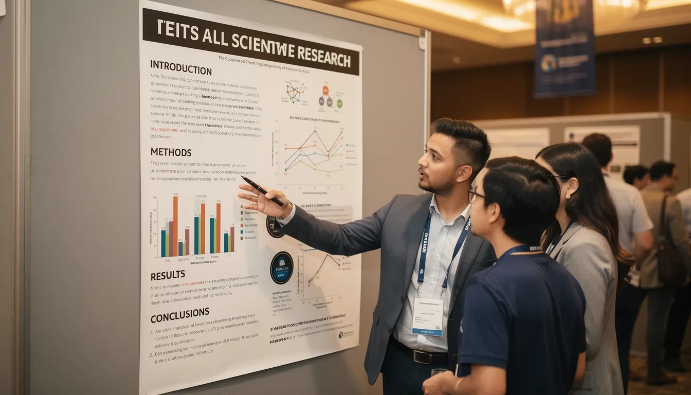
Walk through a poster session at any major conference and you'll see the same scene: rows of text-heavy banners that look like shrunken journal articles, each one begging to be read in full but rarely getting that chance. Most presenters spend months on the science and then three days on the poster. The result is a wall of information that repels the very people it's trying to attract. Getting this right isn't about graphic design talent. It's about understanding that a conference poster is a marketing document for your research — and the currency it trades in is attention.
Why Most Research Posters Fail Before You Even Present
The core problem is that most researchers treat a poster like a paper. A paper lives on a screen or desk, inviting close reading. A poster lives on a wall in a noisy room where a judge has roughly 47 seconds to decide whether to stop. Those are completely different contexts, and they demand completely different approaches.
What conference judges and senior researchers consistently notice first: the title from 10 feet away, then a single strong visual, then white space. Not your methods section. Not your p-values in 14pt font.
The single biggest mistake is information overload. Colin Purrington, a biologist whose poster design guide has been adopted by hundreds of university programs worldwide, calls it the "data dump" problem: researchers try to communicate everything they know instead of the one thing worth knowing.
Common failure patterns:
- Eight graphs when two would do the job
- An abstract copied directly from the paper submission
- Body text that's only readable from 18 inches away
- No clear visual hierarchy, so the eye has nowhere to start
There's also an accessibility issue that gets overlooked. According to Purrington's design guide, approximately 8% of males have some form of color-vision deficiency. If your key finding lives inside a red-green bar chart, roughly one in twelve male viewers can't read it correctly.
The fix isn't to design less. It's to design with intention. Every element on your poster should earn its place.
The Layout Formula: Space Is Not Wasted Space
Standard conference posters are printed at A0 size (841 × 1189 mm), though North American conferences often specify 48" × 36". Before you open PowerPoint or Canva, grab a pencil and sketch your layout on a regular sheet of paper. This sounds old-fashioned. It works.
The 20/40/40 rule is the right starting point: roughly 20% text, 40% figures and illustrations, 40% white (negative) space. That last number surprises most first-time poster makers. Blank space isn't wasted — it's what makes the content breathe and what pulls a viewer's eye to what matters.
"40% of your poster should be clear." — EACR Award-Winning Poster Design Guide
Flow matters as much as proportion. Western readers scan left-to-right, top-to-bottom. Structure your columns so the eye moves naturally: background top-left, results center, conclusions bottom-right. Use numbered headers or directional arrows to make the path obvious. Making someone guess the reading order is fatal.
| Element | Recommendation |
|---|---|
| Poster size | A0 (841×1189mm) or 48"×36" |
| White space | ~40% of total area |
| Text columns | 2–3 with consistent widths |
| Readable distance | Body text legible from 1 meter |
| Print resolution | 300 dpi minimum, CMYK color profile |
| Paper finish | Matte (glossy creates glare under fluorescent lights) |
One practical test before finalizing: print a scaled-down version at A4 and stand 3 feet back. If you can't read anything, neither can a judge.
Content: What to Include and What to Cut
The word count debate in poster design comes down to two schools. The traditional approach, as Purrington's guide recommends, targets 800–1,200 words including figure legends. The EACR's award framework pushes harder, suggesting under 250 words for body text and letting visuals carry the weight.
The right number depends on your field. A structural biology poster with complex crystallography data needs more annotation than a behavioral economics study with a single clean graph. But almost every first-draft poster has too many words. Start at 1,000, then cut.
Structure your content in this order:
- Title — visible from 4 meters, states a finding rather than just naming a topic. "Ketamine reduces cortisol response in social anxiety disorder patients" beats "Cortisol and Social Anxiety: A Study."
- Background — two to three sentences for a smart non-specialist. What's the gap? Why does it matter?
- Methods — brief, ideally as a visual flowchart. Nobody reads a methods wall of text.
- Results — the heart of the poster. One or two strong figures, clearly labeled.
- Conclusions — three to five bullets. What did you find? What does it mean? What's next?
- Contact info — email, institution, QR code to a preprint or supplementary data.
Cut the abstract entirely. Your title and introduction already do that job. Cut grid lines from every graph. Cut logos from prime real estate at the top. And cut any figure that doesn't directly support your main finding.
Typography and Color: Small Decisions With Big Impact
Typography is invisible when it's right and distracting when it's wrong. The core rule: two font families maximum. A clean sans-serif (Helvetica, Inter, or Gill Sans) for titles and headings; a readable serif (Palatino or Georgia) for body text. Mixing more than two typefaces creates visual noise without adding information.
Font sizes that reflect actual readability at conference distances:
- Title: 85–90pt
- Section headers: 56–60pt
- Body text: 32–36pt
- Figure legends: 24–28pt
Color strategy follows the same logic. Pick three to five colors — two or three shades of a primary, one accent, plus standard text colors. Use that accent color exactly once or twice, pointing to your most important finding. If it appears everywhere, it points nowhere.
Always test your palette with a colorblindness simulator (Coblis is free and takes about 90 seconds to use). Red-green combinations fail for a meaningful portion of your audience. Blue-orange or blue-red pairings are safer defaults.
A few details that separate good from great:
- Use sentence case for section headers, not ALL CAPS — it preserves italicized species names and scientific nomenclature
- Keep text box widths to roughly 45–65 characters per line for comfortable reading
- Avoid colored backgrounds behind text boxes; dark text on white is always cleaner
- Set line spacing manually rather than trusting application defaults
How to Tell a Story With Your Data
The Macmillan Group at Columbia University (whose asymmetric organocatalysis work contributed to David MacMillan sharing the 2021 Nobel Prize in Chemistry) have talked openly about how they approach poster presentations. Their advice: connect each data point to a larger narrative. Build toward your central message instead of laying out everything at once.
This sounds obvious until you look at most posters, where results sit in isolation — graph A over here, table B over there — with no thread connecting them.
The story structure that works for most research posters:
- The tension — what problem exists, what's unknown
- Your intervention — the approach you took and why
- The turning point — the key result that changes something
- The implication — what this means for the field or practice
One non-obvious technique: place a single high-quality photograph or illustration in your background section that has nothing to do with graphs but everything to do with your subject. The Macmillan group's advice is that recognizable imagery draws people from across the room before they've read a word. A microscopy image of a neuron, a photograph of your study organism, a clean mechanism diagram. Concrete visuals start conversations.
The title is where your story condenses to one sentence. Titles that state a finding outperform titles that just name a topic. This is the single highest-leverage edit you can make to any poster — and it takes five minutes.
The #BetterPoster Format: Real Shift or Just Hype?
In 2019, Michigan State PhD student Mike Morrison posted a YouTube video proposing a radical redesign of the academic poster. His template put a single bold "main finding" sentence in a large colored band across the center, with everything else as supporting sidebars. The video has since been viewed more than a million times and the template downloaded hundreds of thousands of times.
The format is genuinely better for one specific goal: getting a passerby to grasp your main finding in under 10 seconds. That's real value in a crowded poster hall.
But it has tradeoffs. The format works best when your research has one clean, speakable conclusion. If your work is exploratory, mechanistic, or involves nuanced multi-part findings, forcing it into a single-sentence summary can misrepresent the science. Some judges in traditional fields, particularly clinical medicine and physics, still expect conventional structure.
MIT's "Even Better Poster" templates (available through UC Davis Libraries' research guides) iterate on Morrison's design with dedicated graph sections and better white space integration. Worth looking at as a middle ground between radical redesign and the old wall-of-text default.
Which format should you use? If your conference skews interdisciplinary and you have a crisp main finding, try #BetterPoster. If you're presenting to specialists in a conservative field, stay conventional but apply all the design principles above. The format is a tool, not a doctrine.
The Final 48 Hours: Printing, Practicing, Presenting
Most poster disasters happen not in the design phase but in the two days before the session. Here's where to focus.
Print earlier than you think you need to. Print shops near conference venues are booked out and charge a premium. Campus services typically need 3–5 business days for large-format work. Booking a week ahead versus the day before can easily save you $40 or more, and last-minute jobs often come back on glossy paper when you wanted matte.
Before sending to print, run through this checklist:
- Export as PDF at 300 dpi in CMYK (RGB colors shift when printed)
- Print a scaled-down A3 copy, tape it to a wall, and stand back 3 feet
- Have at least one colleague outside your immediate lab read it cold
- Check every axis label, figure legend, and acronym expansion
For the session itself, prepare two versions of your talk. A 90-second version for passersby who slow down — cover the problem, your main result, one implication. A 5-minute version for people who stop and want more. Don't memorize a script. Know the story and let the conversation shape it.
Stand beside your poster, not in front of it. Make eye contact. Bring printed A4 handouts (or a QR code to a PDF) for people who want more detail. A small stack of business cards also helps — you'd be surprised how many people ask, and how few presenters are ready for it.
Bottom Line
- Commit to 40% white space before anything else. Sketch your layout on paper first.
- Target 800–1,000 words maximum, then cut again. Two strong figures beat six average ones.
- Your title should state a finding, not just name a topic. This single change is worth more than any design tweak.
- Test your color palette for colorblindness before printing. Coblis is free.
- Print a scaled test at A3 and review it from across the room at least three days before the conference.
- Prepare two versions of your pitch: 90 seconds and 5 minutes. Don't memorize — internalize.
The most important mindset shift is this: stop thinking of your poster as a compressed paper. It's an invitation to a conversation. Design it accordingly.
Frequently Asked Questions
What is the standard size for a scientific research poster?
Most international conferences specify A0 format (841 × 1189 mm, roughly 33" × 47"). North American conferences typically use 48" × 36" (landscape or portrait). Always check your conference's specific requirements before designing — some venues have physical board constraints that matter.
How many words should a research poster have?
The traditional guideline from Colin Purrington's widely-referenced poster design guide is 800–1,200 words including figure legends. The EACR's award-winning poster framework recommends under 250 words for body text, with figures doing most of the communication work. Most first drafts are over 1,500 words — cut until it hurts, then cut a little more.
Is the #BetterPoster format actually better, or is it just trendy?
It's genuinely better for clearly-scoped, one-finding research being presented to a mixed audience. Mike Morrison's 2019 template solves a real problem: most passersby won't read a wall of text, so leading with your conclusion in large type gets your message across fast. But it's a poor fit for nuanced, exploratory, or multi-part findings. Use it as a tool, not a mandate.
What do poster session judges actually evaluate?
Most judges assess three things: scientific merit (study design, statistical rigor, originality of the question), visual clarity (can the findings be understood without the presenter), and presenter engagement (how well you explain and discuss your work). Many researchers optimize only for the first and neglect the other two. All three matter, and the weight shifts depending on whether it's a competitive award session or a standard poster session.
What software should I use to design a research poster?
PowerPoint and Keynote are genuinely sufficient for high-quality posters and are what most researchers already know. Adobe Illustrator gives more typographic control and produces crisper vector graphics, but the learning curve is steep. Canva works for simple layouts. Whichever tool you use, set up your artboard at the actual poster dimensions from the start — resizing at the end degrades image quality.
My poster has a lot of data. How do I decide what to cut?
Ask one question about each figure: "Does removing this change my conclusion?" If the answer is no, cut it or move it to a supplementary handout. The goal is not to hide complexity — it's to present the minimum required to make your main finding credible and compelling. Supporting data lives in the paper. The poster is the trailer, not the film.
Sources
- Designing Conference Posters — Colin Purrington
- How to Design an Award-Winning Conference Poster — EACR Cancer Researcher
- Six Tips for Making a Scientific Poster from a Nobel Prize Winning Team — Royal Society of Chemistry
- Better & Even Better Scientific Poster Templates — UC Davis Libraries
- Award-Winning Scientific Posters: Steps to Success — Mind the Graph